

Join devRant
Do all the things like
++ or -- rants, post your own rants, comment on others' rants and build your customized dev avatar
Sign Up
Pipeless API
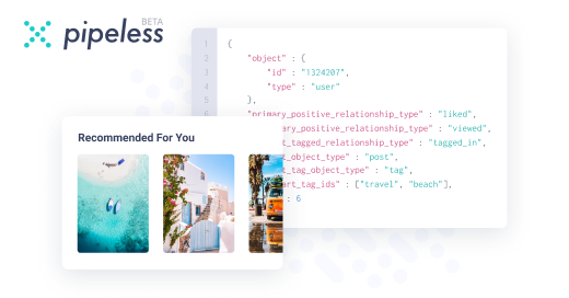
From the creators of devRant, Pipeless lets you power real-time personalized recommendations and activity feeds using a simple API
Learn More


Related Rants


 Clients be like...
Client said the images need to be responsive and go full width.
Told her that would make the images massive and we should have a limit in height a cropping enabled.
She told me it should look nice with full width images uncropped.
Fucking designers said the same fucking thing.
Client today: Hey images are huge. Make sure they look nice.
*sigh*
rant
designers
clients