

Join devRant
Do all the things like
++ or -- rants, post your own rants, comment on others' rants and build your customized dev avatar
Sign Up
Pipeless API
From the creators of devRant, Pipeless lets you power real-time personalized recommendations and activity feeds using a simple API
Learn More


Related Rants


 No, thank you.😆
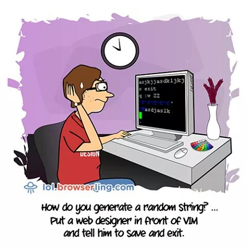 The real random generators!
Microsoft's Design Guideline
undefined
microsoft office is still the best
random