Join devRant
Do all the things like
++ or -- rants, post your own rants, comment on others' rants and build your customized dev avatar
Sign Up
Pipeless API
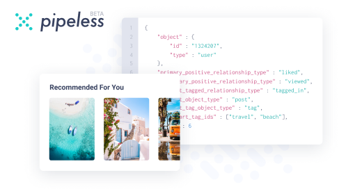
From the creators of devRant, Pipeless lets you power real-time personalized recommendations and activity feeds using a simple API
Learn More


 A good rule of thumb when developing applications with a good user experience is to assume that your user is t...

 When users are doing whatever they want
Please don't use shake animations to signify errors, dear user interface designers.
The shake animation is a bad idea introduced to the UX (user experience) world by Apple in 2013 with iOS 7 and Mac OS, and is popularly used by FilePond in response to a failed upload. At some point, this animation was added to the Cinnamon desktop environment login screen in response to a wrong password.
The shake animation is not helpful at all. If anything, it is irritating and provocative.
The red "incorrect password" or "failed upload" text clarifies it well enough. There is no need for a shake animation to rub it into the user's face.
rant
user experience