Ranter
Join devRant
Do all the things like
++ or -- rants, post your own rants, comment on others' rants and build your customized dev avatar
Sign Up
Pipeless API
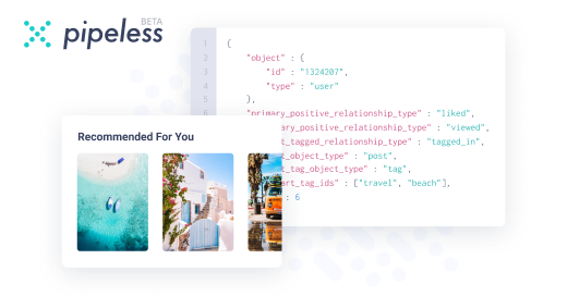
From the creators of devRant, Pipeless lets you power real-time personalized recommendations and activity feeds using a simple API
Learn More
Comments
-
@ste09 and it's only like 1 or 2 so you'll really save on ammo. Probably even take only 1 bullet if you're good lol
-
 stisch48367y@ste09 agreed!
Damn users. They're the worst. I prefer the company of my unit tests. They're so much chummier. -
 Eariel19167yBottom navigation bar is part of Material Design, recommend for mobile. So it's OK as it is.
https://material.io/guidelines/... -
 tahnik390557y
 -
While there is complaints that Android users can't reach the tab bar at the top; I'm sitting here with my iPhone in my hands where if I need to touch the navigation bar at the top, all I have to do is just tap on my home button lightly to activate reachability ;) Apple isn't so bad...in some ways..
-
@tahnik devRant is clearly not MD so why does it matter if it's in the spec or not?
-
@tahnik They are complaining of guidelines this app clearly doesn't follow and never has so it's a mute argument with either party.
Save yourself the bother, it's not worth it. -
It really feels like nav bars being at the bottom on mobile should be the standard with so many huge phones on the market, it just feels so much easier. Or how about a menu arc that pulls out from 33% in from the bottom left corner centred on the bottom right corner, with a reversed option in the settings for lefties
-
DevRant never really had material design, but I prefer the old navigation drawer with a notification button up there over this tabbed view. I don't use the other tabs that often to justify having it all the time on screen.
-
 kshep9232787yGoogle might have gotten it wrong with the tab placement. Nav tabs at the bottom seem more natural and easier to use to me.
 -
@dontbeevil well, they were the first ones that wrote a whole book about MD, so they can claim that those specs are their content :)
-
 Voxera118197y@stisch Well your unit tests must be very timid .
My make every effort to try to break my app going for any lapse I make :/


Related Rants

 EDIT: devRant April Fools joke (2017)
-------------------------
@trogus and I have had an absolute blast worki...
EDIT: devRant April Fools joke (2017)
-------------------------
@trogus and I have had an absolute blast worki...
 True that~~
 What does dfox say ?
DEV, DEV, DEV, DEV ,DEV, DEV
RANT, RANT, RANT, RANT, RANT
What does dfox say ?
DEV, DEV, DEV, DEV ,DEV, DEV
RANT, RANT, RANT, RANT, RANT
dfox: "Let me make life easier for them. Introducing tab bar!"
users: "tab bar is hard to reach on top. please move it to the bottom"
dfox: "But you never complained when the hamburger was at the top-left corner. nvm I'll do it"
users: "ugh, where is the material design. Move the tab bar to the top. Make it scrollable"
dfox: "sudo rm -rf /users"
undefined
dfox
users